Connections Nightclub is an institution in Perth and, like all timeless icons, it has reinvented itself several times over the years. A previous extension we’d done to the existing balcony proved extremely popular, and the owners were looking for a way to create more outside space. Alongside the stunning city views, it would also offer an open-air place for people to smoke – a necessity in Perth clubs with the introduction of new smoking regulations.
We were aware of a disused roof space behind the club’s back-of-house offices, and developed a design around transforming it into a sizeable roof terrace. The concept was to create a simple, welcoming open-air space with a relaxed atmosphere, in keeping with the club’s loyal clientele. We started with a sturdy concrete platform supported by steel columns, engineered to support loads many times the capacity of the space. The resulting terrace has a tucked-away, intimate feel thanks to the surrounding buildings and old brick surfaces, which we emulated with new walls in recycled brick and contrasting grey concrete block.
Timber decking and coloured party lights added the finishing touches to the casual backyard atmosphere the owners were looking for. With its back to the busy club and its face to the sky, the new rooftop terrace has proved a huge success – and boasts possibly the best city skyline views of any club in Perth.
Reposted from Instagram
The refit of an old Highgate corner deli into Chindarsi Architects’ own offices carried particular weight for us. We wanted to create a space that was not only a showcase of our ability, but also a demonstration of how important architectural design is as part of a business identity and brand.
It was important for the office to reflect our collaborative approach, with areas for the team to come together around common creative projects – we needed to create a space for creating spaces. Inside, the practice is open plan, to break down the traditional ‘cells’ of office spaces, with separate areas defined by lighting and cabinetry rather than partitions. We had our tables custom designed to be fit-for-purpose as workstations or meeting tables, and built them from structural steel. Coloured wall-planes offer privacy and seclusion for solitary work, without putting up boundaries to group input.
We worked closely with graphic designer Steve Binnie to develop the visual identity and signage elements of the building. The iconic corner deli shape was retained, and the original signage was preserved and remains visible through the new paintwork.
Reposted from Instagram
Barolo on Beaufort was blessed with a fantastic space and an enviable location, right in the heart of Highgate’s Beaufort St precinct. The owners wanted an edgy Italian bar which captured the romance and nostalgia of the Continent, but with an authenticity which went beyond simple ‘vintage.’
We capitalised on the space’s existing assets by stripping back the plaster to expose the old brickwork, and utilised the beautiful interior arches to frame intimate spaces within the restaurant. We used natural materials with Italian flavour, like solid timbers and Bianco Carrara marble, and dressed the exterior with cloth canopies and a traditional ochre limewash which will acquire a beautiful patina with age. Inside, imposing wooden wine racks break up the wall space and showcase the venue’s extensive wine collection. We also commissioned large-scale reproductions of original Campari posters to be painted on the interior walls, and used Deco light fittings to give patrons a true sense of the era. This gives real romance and a moody, very Italian quality to dining at Barolo, crucial elements to the experience the owners wanted to create.
The challenges of the project were clear from the outset: the building, an old bank, was essentially a bare shell, and council regulations around building licences, patron numbers and parking were strict. Extensive experience with the regulatory side of commercial projects helped us to complete the re-fit – including all of the plumbing, electrical, equipment and service requirements for a commercial kitchen – under a very tight turnaround.
Reposted from Instagram
In the nightclub business, there’s a fine line between creating a distinctive space for patrons and making yourself too ‘exclusive’ for a good night out. The owners of Mint, in Northbridge’s famous nightlife precinct, wanted to bring the space back to the heart of what a nightclub should be: a relaxed place for people to enjoy themselves and let their guard down in a social setting.
Our inspiration came from something which gives us all comfort – the concept of home – and from there into the fascinating world of suburbia. We took an irreverent approach to suburban icons like picket fences, lawn and garden gnomes, with domestic lighting and some tongue-in-cheek kitsch, like wall-mounted flying kookaburras. We turned many of these everyday items on their heads or recreated them in stark white to give patrons a flash of the unexpected in familiar things. The effect is humorous, unpretentious and disarming, offering the comfortable alongside the surprising, and the everyday alongside the ridiculous.
The club’s furnishings are in keeping with the suburban theme, a combination of comfortable leather lounges, open banquettes and white novelty armchairs. We maintained a clean, sophisticated feel with finishes in a dominant palette of warm timber panelling, gold tones and a dark ceiling. Bright wallpapers and vivid artificial lawn add texture and colour alongside flashes of luxurious marble and onyx. The owners were thrilled with the results and the unique fit-out saw Mint win a Commendation at the RAIA WA Chapter Architecture Awards in 2008.
Reposted from Instagram
This compact lunch bar is tucked away beneath the main foyer of the Allendale Square building on St George’s Tce. It catches the walking traffic from the new pedestrian link to the underground train station – a fast-moving client base with big surges at peak times throughout the day. With a small space and discerning customers in a big hurry, the owners needed a solution which would showcase their brand at a glance, deliver speedy service and give maximum visual impact to their selection of delicious food and drinks.
Old wooden packing crates for vegetables were the initial inspiration for our design. A series of timber and stainless steel-lined benches and suspended bulkheads frame the activity of the kitchen. A slick glass display gives pride of place to the food and allows enough room for a generous selection with plenty of options. The counter also curves around to facilitate the orderly flow of service, allowing customers to find and purchase what they want as quickly as possible. The kitchen is likewise streamlined to minimise double-handling and ensure smooth workflow between preparation, cooking and cleanup.
The name ‘Lunches Down Under’ is unashamedly patriotic, so we wanted to make the space uniquely Australian as well. The walls feature a vintage floral pattern reminiscent of enlarged cross-stitch embroidery, to give the space a comfortable ‘home kitchen’ feeling. We also chose Australian timber for the fit-out, which contrasts light Victorian Ash panelling with the rich, warm tones of Queensland Walnut veneer.
Reposted from Instagram
The original fit-out of this penthouse was instated as part of the Cottesloe Flour Mill’s conversion to apartments around 1998. The ageing interior was in very poor condition and the new owners, the architect’s aunt and uncle, approached Chindarsi for a complete refit. Years spent in Copenhagen had given them a love of apartment living, and they wanted to recreate the sophisticated, cosmopolitan lifestyle they had enjoyed in Denmark. They were also looking to downsize, having just sold their suburban bungalow, so careful economy in the use of space and storage was important.
We began by stripping out the majority of the tired interior, leaving the heritage structure, floors, trusses and timber shutters to retain the character of the building. A softer colour scheme grounds the penthouse in the coastal location, with tones reminiscent of sand and sun. Against this lighter background, we installed a range of textured natural materials – American oak cabinetry, Blackbutt boards and limestone flooring – accented with the black industrial steel of the staircase and the original exposed girders. This gives the apartment a clean, peaceful feel reminiscent of classic Scandinavian style, but with an additional measure of comforting solidity and warmth.
The use of space was a chief concern for the owners, who enjoy sharing their home with family and guests. We completely remodelled the kitchen to give them room to entertain, with an open-plan dining/living space to create a relaxed ‘breakfast bar’ atmosphere. We also integrated the fridge and freezer into the cabinetry so that they disappear completely when not in use. The upstairs living area has likewise been opened up with bi-fold doors, and now features an integrated fireplace/display cabinet, to house the owners’ cherished collection of objects from time spent abroad. We also made the most of the unused space under the stairs with a bespoke rack for their impressive wine collection.
Reposted from Instagram
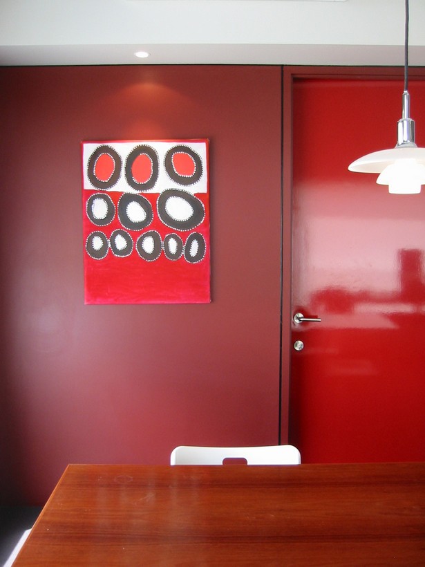
Connections Nightclub has been an institution in Perth for decades, and has become necessarily skilled at transforming itself to meet the needs of its clientele. With patrons from a wide range of backgrounds, ages and music tastes, Connections was looking to create a more open, inclusive space with a sophisticated feel – and a little drama, of course.
This project was the first stage in a much wider transformation, which continued with the club’s 2007 rooftop terrace addition, also designed by Chindarsi. The re-fit, developed in collaboration with Matthew Palmen, incorporated the popular dance floor and upstairs lounge areas as well as the small rear balcony. The owners had a modest $40k budget, so we also needed to manage costs, with a focus on simplicity and low-maintenance, quality materials. We kept the intimate feeling of the upstairs section with changes to the floor level, which also allowed better views of the dance floor and the performance stage. The transition to the open main area now steps down in wide landings to offer more ‘loitering’ room at different heights, to facilitate better social dynamics and all-important eye contact between patrons.
The finishes are carefully selected to give the club a feeling of extravagance, without overpowering the experience of the music and entertainment. A choice of paint and materials in shades of deep blue gives the surroundings a sense of sumptuousness and mystery. In contrast, slick red PVC wall panels give the upstairs section an edgier atmosphere, a little removed from the dance floor. We tied the different areas together and added a touch of decadence with details and features in gold leaf.
Reposted from Instagram
This project, the old Rise nightclub on James St in Northbridge, already had one of Perth’s most enviable club locations. The owners were looking to revitalise the space with the goal of appealing to a younger crowd of more mainstream pop fans.
The club was intended as a means of ‘escape’ for patrons, and from this starting concept we built an overarching theme of ‘travel’ for the new fit-out. Our design drew inspiration from luxury jet interiors, the glamorous 1960’s Golden Age of travel and even sci-fi movies like 2001: A Space Odyssey. From street level, patrons are greeted with an aircraft cargo door to give them a feeling of being literally ‘ready for boarding’ to be transported somewhere else. A red padded leather interior leads upstairs to a series of portholes displaying not the view outside, but LCD footage from 20,000 feet up. Once inside, the club offers a slick, high-tech experience reminiscent of guest service aboard a futuristic jetliner. Light and reflection play a big part in the venue’s visual impact, with pop-riveted stainless steel panelling, polished chrome, black sheers, back-lit onyx, perforated aluminium and reflective discs in the bar and dance floor areas. The balcony, which gives the club so much presence on the street, was remodelled into a streamlined ‘aerodynamic’ curve, with strips of LED lighting and an aluminium frame. Just as with a travel experience, adventure needed to be balanced with comfort, so we installed padded leather furniture and velvet drapery to bring a sense of luxury and sensuous intimacy.
The aesthetics were only part of what we needed to consider for the new fit-out. The scope of the refurbishment involved gutting the club and bringing not only the structure, but all fire separation and detection, electrical, lighting, hydraulic and mechanical services up to current code. The CBUS lighting control system also wires back to the Lighting Control Booth enabling one-touch control for the full range of different lighting settings.
Reposted from Instagram
There are few places in WA which can rival the historic appeal of Fremantle, and even fewer properties with the potential we saw in this former warehouse, located on Arundel St. Built in 1928, the warehouse later became a winery and we were given the opportunity to design its next transformation into a pair of contemporary luxury townhouses.
Preserving the heritage features of this beloved building was a chief concern from the beginning. The façade retains much of the warehouse’s original character, and our choice of materials is consistent with the building’s origins: traditional red brick, natural timber and industrial steel. We also retained the original wine vats in the courtyard, giving the owners a tangible connection to the building’s history. Inside, we converted the generous space into three-storey residences, each with almost 300m2 of living space. Exposed trusses and soaring ceilings give clear reminders of the home’s past, with mezzanine levels and an open-plan approach to the living areas to give the owners a real sense of space.
The design is centred on the luxury lifestyle we envisaged for the owners, with an emphasis on Fremantle’s coastal character. The ground floor features floor-to-ceiling glazing and opens out onto a private courtyard with a two-storey feature brick wall: the perfect way to enjoy the sea breeze on summer afternoons. The top-floor master bedrooms are extravagant in their proportions and outlook, each blessed with magnificent views across Fremantle to the ocean. The finishes and fittings are of the highest quality, with Essa stone bench tops, Smeg appliances, marble bathrooms, deep deluxe baths, ensuite and walk-in-robes. We also wanted to maximise the convenience of the building’s incredible location, a two-minute walk from the heart of Fremantle. The homes feature electric gates and automatic garages, with intercom access for the reassurance of ‘lock and leave’ security.
Reposted from Instagram
This was a delicate project from the outset; the property is listed in the City of Subiaco Council Municipal Inventory as a place of cultural heritage significance. A single storey, classically Federation home, the residence had been sadly neglected by previous occupants. The owners wanted to restore and revitalise the property, with all the modern amenities, but were very aware of the restrictions around their home’s heritage-listed status.
The first part of the project was a rescue mission; the house had to be liberated from the wildly overgrown garden. We then carefully removed the existing rear kitchen, laundry, roof, brick fireplace and weatherboard walls, as well as the dilapidated outbuildings. The parts that were left – the front section of the house and the facade – retained enough of their Federation charm for us to commence restoration. Our goal was to faithfully repair and restore the exterior to its original condition, replacing unsalvageable elements like-for-like where possible. The spectacular new front façade is a testament to this, complete with gable roof-end period panelling, ridge finials, bull-nosed verandah, lattice timber frieze, brackets, post, balustrades and full-height timber-framed lead light double doors. Far from dating the home, the restored facade gives it prestige and stature in the streetscape – and the owners couldn’t be prouder.
The contemporary elements of the addition were kept out of sight, in the interior sections and to the rear of the property. As a family of five, the owners needed a home which would accommodate a busy modern lifestyle. We retained and refurbished all of the front bedrooms and transformed the old dining room into an ensuite bathroom. A modest upper level conforms to strict heritage requirements and houses the kids’ bedrooms. A new powder room and walk-in robe are accessed from the intact grand living room, which boasts perfectly restored fireplaces, ceiling roses, cornices and pendants, as well the original bay window. The rear of the house is extensively glazed and bathed in natural light, opening up completely to unite the living space with the new pool and outdoor entertaining deck.
Reposted from Instagram